
Best Fonts for Subtitles: A Complete Guide
Transcribe, Translate & Summarize in Seconds
The best fonts for subtitles majorly impact the engagement and reach of a video. For one, it affects readability, accessibility, and professionalism. Further, it helps the audience comprehend the message and engage more with your content. So whether you create content for YouTube, social media, or others, the typography tips for videos should help.
The guide lists the popular fonts for subtitles so you can select one that best suits your video style. You will also learn how to use the best tool to create a subtitle that elevates your video captions.
Top Fonts for Subtitles in 2026
Choosing the best font for subtitles does not have to be challenging. The following section provides the top choices for improving subtitle readability and engaging the audiences more. So, consider every element, including the format and font, to make your captions as appealing as possible. Following are some of the popular font types:
Arial: It is one of the most popular subtitle fonts, known for its simplicity, clarity, and compact design.
Verdana: It considers your display's pixel orientation and adjusts accordingly to ensure clarity, even on low-resolution screens.
Roboto: This geometric-type font provides a sense of rhythm and is available in various styles and lengths.
Helvetica: Its concrete, holistic, and strong look makes it a favorite of writers, designers, videographers, and others.
Open Sans: This font type is known for its exceptional readability and suitability on most screen sizes.
Montserrat: Its modern aesthetics and balanced letterforms for exceptional readability make it a popular choice.
Times New Roman: Its unique design makes it suitable for professional documents and usable in videos.
1. Arial
Sans-serif fonts are the most commonly used fonts worldwide. Arial is the most popular sans-serif font type due to its readability, legibility, and safety.
It is not a fancy, flashy font, so it is suitable for multiple contexts. Its clear and compact design ensures compatibility if you need to add symbols and numbers to your captions. Subtitles do not distract audiences from the video content, so they easily comprehend the message.
2. Verdana
Verdana is the best contender for the top fonts for video subtitles in the Sans Serif typeface family. The reasons are apparent. First, it considers the pixel orientation of computer displays and appears clear, irrespective of resolution. The subtitle resolution would not be affected even if the screen resolution is lower. Besides, the large x-height and open spacing make it legible in small sizes, and therefore, it is used widely on the web.
3. Roboto
Roboto is another simple sans-serif typeface that will not distract your audience much from the video. Its unique characteristics often make it a first choice for YouTube or Google. For instance, its distinct mechanical layout and clean geometric curves provide a sense of rhythm. It is available in various font styles and lengths, so creators can make it look any way they wish.
4. Helvetica
Helvetica has been a go-to font type and is equally loved by writers, designers, videographers, and others. Its concrete, strong, and holistic look and feel is the primary reason. For better design aesthetics, it offers multiple typefaces (Helvetica Medium Italic, Classic Yellow Subtitle, etc.).
Furthermore, no projection or curves in the ends makes it easier to read, especially for those with low-resolution screens. In short, it is a great font type for your subtitles if you want something simple yet effective.
5. Open Sans
If you are looking for a font that enhances video accessibility, Open Sans might be a good choice. It is known for its exceptional readability and suitability for multiple screen sizes, mobile or desktop. The text looks clean and consistent on every device and seamlessly fits into casual and professional settings. This makes it a reliable choice for any of your video subtitles.
6. Montserrat
Montserrat, designed by Julieta Ulanovsky in 2010, has been quite a popular font choice for video subtitles. You might have seen it in videos of popular influencer Alex Hormozi. It combines vintage and modern aesthetics to complement your visual style while delivering the message. Also, its balanced letterforms and easy readability make it a suitable choice for any video form.
7. Times New Roman
Times New Roman is another popular font type created by the famous British magazine, The Times. It has come a long way from being a standard and favorite font in older versions of Microsoft Word. Things might differ, but a hint of uniqueness makes your work look sophisticated.
Times New Roman is suitable for subtitles with short sentences on the screen but ensures its size is a bit big. The small-sized subtitles in this font are challenging to read due to their intricate details, potentially causing eye strain.
Why Font Choice Matters for Subtitles
Accessibility is the primary reason for customizing subtitles with fonts. The right font allows people with hearing impairments and non-native speakers to enjoy your content. That is not it. Here is why professional subtitle formatting is crucial:
Improve Readability: The font style, size, and color dictate how viewers engage with the content.
Enhance Accessibility: An ideal font style allows non-native viewers and those with hearing disability to understand the underlying message.
Match Video Style: A font style must match the video type so as not to distract the viewers from the content.
Boost Viewer Engagement: A subtitle in a proper font that syncs with the video ensures readability, minimizes distractions, and engages viewers.
Improve Readability
The font style, size, and even color can impact the readability of subtitles and, in turn, video engagement. A study by the Washington Post reveals that individuals can read up to 35% faster when their preferred font type comes up. A too small or not visually aligned font makes it difficult for viewers to read the text. At the same time, a font that is too big hampers the viewing experience.
Enhance Accessibility
The font you choose for your video must be clear, well-sized, and not complicated for viewers to comprehend. It is important for people with hearing disability who rely primarily on video captions. Also, you must customize the subtitles when translating them into different languages. Adjust the font style to accommodate different character sets, alphabets, and reading directions.
Match Video Style
The caption and font style must match the video to ensure immersiveness. For example, a serious drama or thriller might not use the same font as a light-hearted comedy. A font clash with the video style can feel jarring and distract viewers from the message.
Boost Viewer Engagement
A well-chosen font style minimizes distractions, ensures readability, and aligns with the video tone. This makes it easier for viewers to follow the content and comprehend the message even in a noisy environment. It increases the likelihood of them to engage with the video.
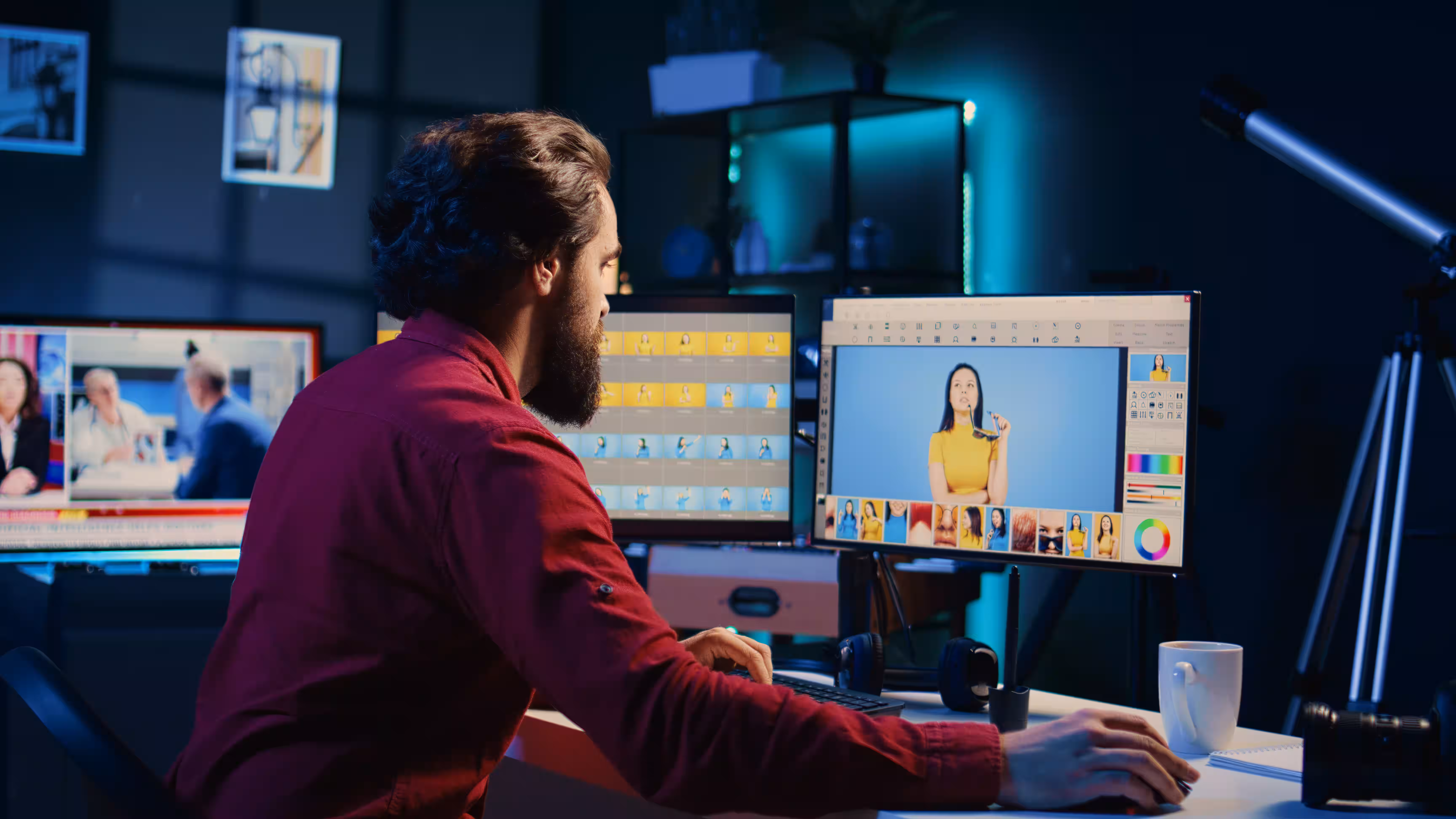
How to Customize Subtitles with Fonts Using Transkriptor
Transkriptor is an AI-powered tool that transcribes your audio into high-quality and accurate texts. Besides, its speaker identification, timestamp selection, and numerous editing options make it the best tool for subtitle customization. Follow the steps for that:
Upload your video in the Transkriptor and generate an accurate subtitle file within minutes.
Transkriptor allows you to edit the text, adjust timings, adjust text length, and set limits on words.
Select from the available fonts like Arial, Verdana, Roboto, Helvetica, and more.
Use the platform design tools to change your subtitles' font, color, and style.
Download the subtitle file or embed it into a video and download it.
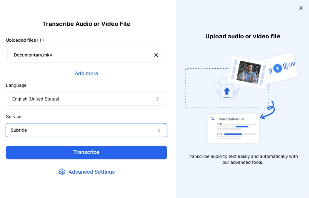
Step 1: Generate Subtitles
Open Transkriptor on your desired device and log in using your email ID or Google account. Access the dashboard and tap on Transcribe audio or video file > Browse files to upload the audio/video file.
Once the upload is complete, select your language and the service type “Subtitle.” You can also tap the “Advanced Settings” option to choose the speaker count, transcription destination, and labels. Then, tap on Transcribe to generate subtitles. It takes a few seconds to minutes, depending on the file type and size.
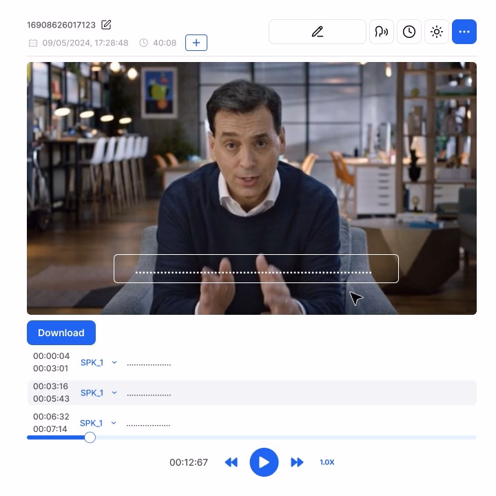
Step 2: Access Subtitle Editing Tools
As you have the transcribed file, it is time to make your videos more accessible. Transkriptor offers a range of customization options, such as text edits, time adjustments, and real-time previews. Besides that, you can configure the length of subtitle lines and set limits on words and characters. This potentially improves readability and, in turn, engagement.
Step 3: Choose a Font Style
To further improve readability, Transkriptor has professional fonts for video captions. You can choose from and apply popular fonts like Arial, Verdana, Roboto, Helvetica, and more. Ensure the text syncs with the video and the font matches the style for maximum impact.
Step 4: Adjust Formatting
Aside from the fonts, it is crucial to format the subtitles, so change the font, color, etc. The accessible subtitle design feature allows you to do it all for better video engagement. It helps maintain a constant style throughout the video for a professional look.
Step 5: Export Subtitles
If you are satisfied with how your subtitles look in videos, it is time to download it. You can export it in SRT format or embed it into your video. The latter saves you the effort and the need to embed the subtitles in your video file.
Additionally, Transkriptor can split the text by characters, words, sentences, timestamps, or voiceover blocks. This helps viewers comprehend the idea better, improve the pace, and have a better viewing experience.
Conclusion
Selecting the best font for subtitles can significantly impact the video-viewing experience. Fonts like Verdana, Arial, and Roboto can balance professionalism and readability, but you need the best customization tool. Transkriptor is the best audio-to-text tool, with plenty of customization options while maintaining accuracy and speed. Use the tool and follow typography tips for videos to enhance the aesthetic appeal and accessibility of the captions.